

React Design Editor is a module for React, written in Javascript/Typescript which provides two primary features:
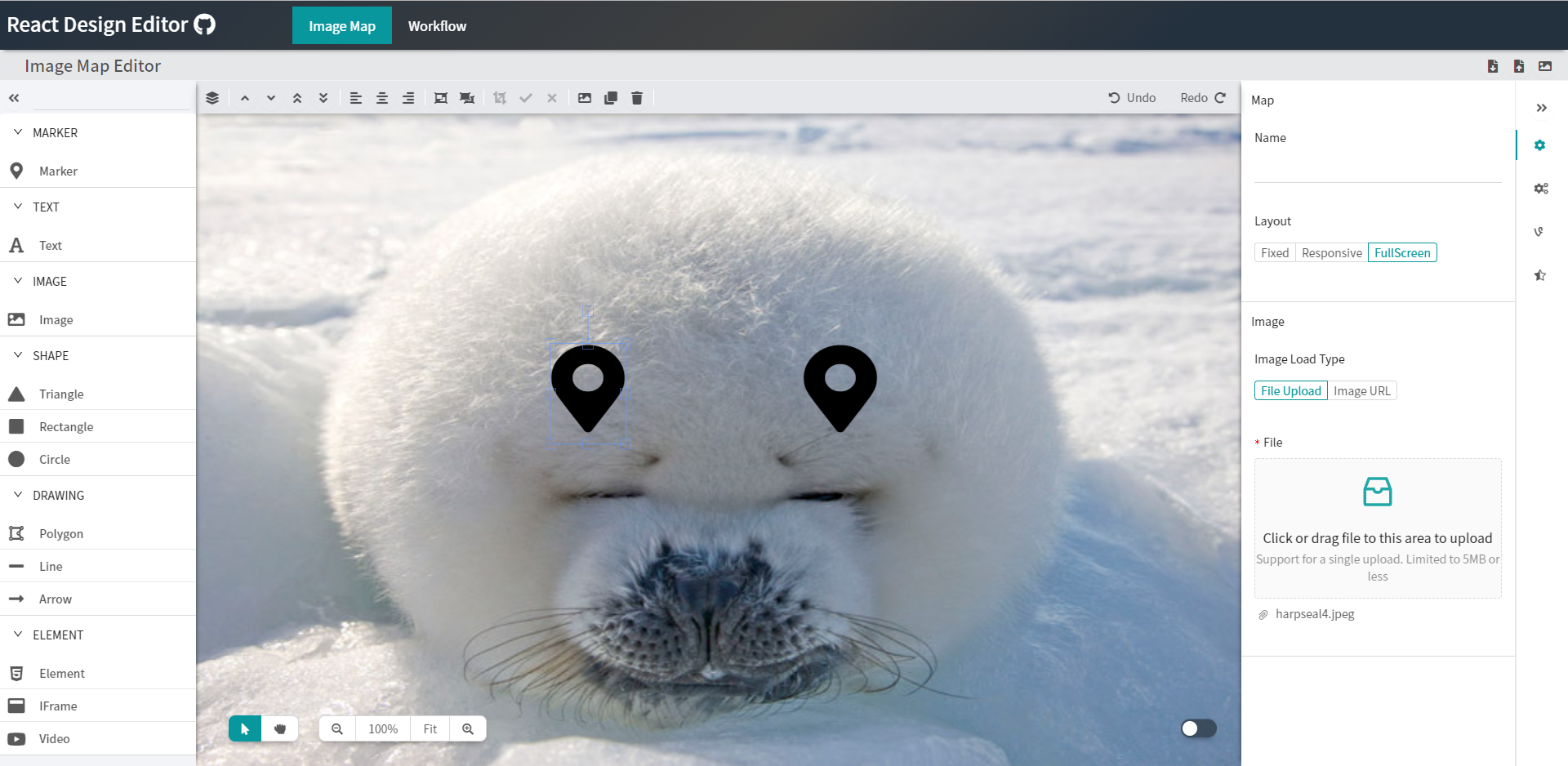
- Image Editor - Create images in React, draw diagrams and arrange compositions using the image editor and save the result to one of several export formats, provides functionality similar to Powerpoint.
- Business Process Modelling (BPM) - Design flowcharts and process workflows in React and export the model to JSON, which can be imported into the tool (load/save).
The module primarily uses the Ant Design, Fabric.js and React libraries, but a full list of required dependencies can be found below.
Try it out today - the project is being continually developed to support a variety of different functions.
- Add, remove, resize, reorder, clone, copy/paste and drag/drop elements
- Build workflows with configurable trigger, logic, data and action nodes
- Connect workflow nodes with labeled ports, multiple routes and automatic layout
- Review workflow validation, canvas status and undo/redo history
- Drawing capability, with polygon, line, arrows and link support
- Preview mode, tooltips, group/ungroup and zoom functionality
- Upload (with drag/drop), import and export to JSON or image
- Image cropping, Image filters, alignment, alignment guides
- Snap to grid, context menu, animation and video element
- Various icons in icon picker and fonts from Google Fonts (20)
- HTML/CSS/JS Element, iFrame element
- Animation support, with Fade / Bounce / Shake / Scaling / Rotation / Flash effects
- Monaco code editor with HTML / CSS / JavaScript preview
- Various interaction modes, including grasp, selection, ctrl + drag grab
- Multiple layouts, with fixed, responsive, fullscreen and grid modes
- SVG, Chart and GIF elements
- Undo/Redo support
- Light and dark editor themes
- Wireframes - in development
- Multiple Map - in development
- Ruler - in development
Run npm install react-design-editor or yarn add react-design-editor
Import the bundled editor stylesheet from your app entry:
import 'react-design-editor/react-design-editor.css';Then import the components you need from the package entry.
- Clone this Project with
git clone https://github.com/salgum1114/react-design-editor.git - Install dependencies with
npm installoryarn - Run the App with
npm startoryarn start - Open your web browser to
http://localhost:4000
Library builds run with Vite only:
npm run build:demobuilds the demo app intodocsnpm run build:libbuilds the package intodistand emits declarationsnpm run servepreviews the demo build locally
The published package provides the Canvas component and its canvas handlers. Toolbars, palettes and property panels shown in the demo can be built around this component as needed.
import { useRef } from 'react';
import { Canvas, type CanvasInstance } from 'react-design-editor';
import 'react-design-editor/react-design-editor.css';

export default function DesignCanvas() {
	const canvasRef = useRef<CanvasInstance | null>(null);

	const addRectangle = () => {
		canvasRef.current?.handler.add({
			type: 'rect',
			name: 'Rectangle',
			width: 160,
			height: 90,
			fill: '#5ee0bd',
			rx: 8,
			ry: 8,
		});
	};

	const saveCanvas = () => {
		const objects = canvasRef.current?.handler.exportJSON() ?? [];
		localStorage.setItem('design', JSON.stringify(objects));
	};

	const loadCanvas = async () => {
		const saved = localStorage.getItem('design');
		if (saved) {
			await canvasRef.current?.handler.importJSON(JSON.parse(saved));
		}
	};

	return (
		<div>
			<button type="button" onClick={addRectangle}>Add rectangle</button>
			<button type="button" onClick={saveCanvas}>Save</button>
			<button type="button" onClick={loadCanvas}>Load</button>

			<Canvas
				ref={canvasRef}
				style={{ width: '100%', height: 600 }}
				canvasOption={{ backgroundColor: '#f4f7f9' }}
				workareaOption={{
					width: 800,
					height: 500,
					backgroundColor: '#ffffff',
				}}
				canvasActions={{
					clipboard: true,
					transaction: true,
				}}
				onSelect={object => {
					console.log('Selected object:', object);
				}}
			/>
		</div>
	);
}
Use canvasRef.current.handler to add or remove objects, change the selection, control zoom, run undo/redo operations and import or export canvas data. The parent element or the style prop must provide a visible height when responsive sizing is enabled.







| Dependency | License(s) |
|---|---|
| React | MIT |
| Ant Design | MIT |
| Fabric.js | MIT |
| MediaElement.js | MIT |
| React-Ace | MIT |
| interact.js | MIT |
| anime.js | MIT |
| Vite | MIT |
| Babel | MIT |
| fontawesome5 | Icons (CC BY 4.0), Fonts (SIL OFL 1.1), Code (MIT) |